


VIBRANT
Logo · Menu · Website · Signage · 2025
BRAND REDESIGN

BRAND REDESIGN
Logo · Menu · Website · Signage · 2025

BRAND REDESIGN
Overview
THE BRIEF
MODERN MEXICAN FUSION HOUSE
TOSTADAS is a modern Mexican fusion house bringing bold flavors, vibrant energy, and a social dining experience to San Jose. We remix traditions with creativity, culture, and cocktails, serving food that tastes as good as it looks.
BRAND PERSONALITY
THE ENERGY
Located near San Jose State University, TOSTADAS serves young professionals, students, content creators, and tech workers aged 21–40 who value experience over fine dining. It's a place for friends, birthdays, and weekend brunch, focusing on cocktails, creativity, and community gathering.
VIBRANT
REMIXED TRADITIONS
FUSION SPIRIT
REMIXED TRADITIONS
VIBRANT
MODERN
COCKTAIL-DRIVEN
WEEKEND SPOT
ENERGETIC
SOCIAL
COMMUNITY GATHERING
VIBRANT
CREATIVE
CREATIVE
Brand Color Palette
EXPLORATION · COLORS
Drawn from the moodboard with coral reds for energy, amber yellow for warmth, deep forest green for depth, lime for freshness, and tan for earthy Mexican roots.
Coral Red
#FF4E45
Energy · CTA · Accents
Amber
#FFB329
Primary UI · Buttons · Navigation
Lime
#122C2A
Dark backgrounds · Headers
Forest Green
#C8E26A
Fresh accents · Logo detail
Terracotta Tan
#C68D6B
Earthy warmth · Headings
Cream
Page backgrounds · Cards
#FAF5EC
Typography System
EXPLORATION · FONTS
DISPLAY & HEADINGS


Anton is a condensed, high-impact sans-serif with a modern geometric feel. Its weight commands attention without aggression, perfect for a vibrant, energetic brand identity. Used for all headings, navigation, and section titles.
BODY & DESCRIPTION
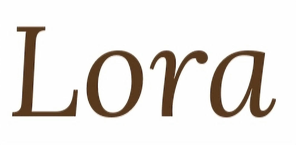

Lora provides warmth and legibility for body text, menu descriptions, and labels. Its slight elegance balances the boldness of Anton without competing for attention.
Logo Evolution
DESIGN PROCESS · LOGO
The logo concept centers on a cocktail glass filled with shrimp and lime, a direct nod to TOSTADAS' signature food and cocktail culture. The glass doubles as the "T" in the wordmark. Anton typeface was chosen for its bold, modern energy.
Hand-drawn explorations with chili chef, circular badge, lemon motifs.
Initial Sketch


Combined with handsketch typography and logos. Used chili as a chef.
First Selection
Cocktail glass + food. The "T" substitution concept locked in.
Final Direction


Full brand palette applied with red, lime, amber, tan, forest green.
Applied Colors
Website and Tablet Menu Re-Design
DELIVRABLE · WEBSITE · TABLET
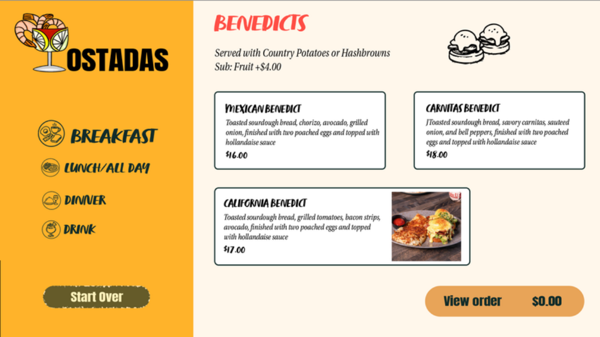
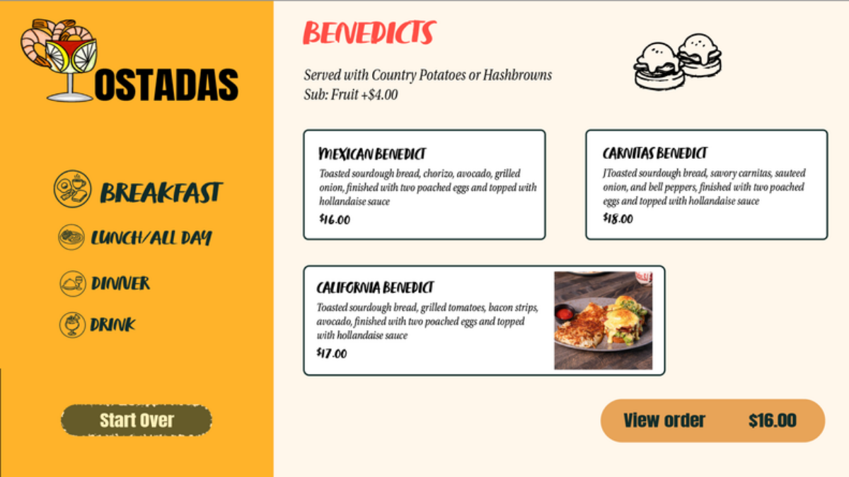
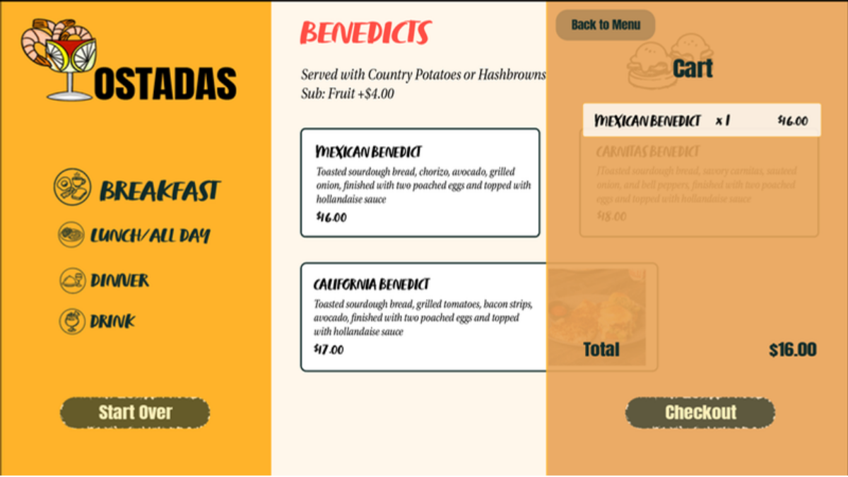
The website was redesigned with the full brand palette with amber sidebar navigation, bold Anton headings, and rich food photography. The tablet-first menu design makes ordering intuitive at the table.




Sample Printed Menu
DELIVRABLE · PRINTED MENU
Clean two-column layout using Anton for category headers and a serif body for item descriptions. Organized by Skillets, Entrees, and other categorie, legible at a glance and brand-consistent.

Brand In the Wild
DELIVERABLE · BRAND APPLICATIONS
The redesigned brand extends across all physical and digital touchpoints, from the street sign you see walking by, the digital platform that you use during free time, and to the uniform staff wear every day, and the physical items used in the restaurant including the napkins and business cards.
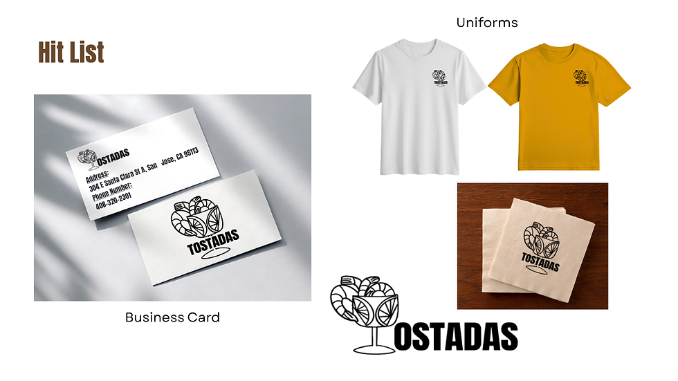
Business Cards & Uniform
White & amber staff uniforms · Logo on napkins

Glass Window
White frosted logo etched on restaurant window

Street Signage
Store street sign & specials A-frame board mockup

Instagram Posts
Food & cocktail social content for brand awareness
The Transformation
BEFORE & AFTER
The original TOSTADAS brand used a circular badge logo with orange and yellow, functional but lacking the modern energy the restaurant's vibe demands. The redesign injects personality, cohesion, and a distinct identity that stands out in San Jose's competitive dining scene.

BEFORE
